Serif or Sans Serif for a Long Printed Page?
Serif or sans serif for a long printed page depends on size, spacing, line length, and purpose; learn how to judge the page as a reading system.
Serif or sans serif for a long printed page is not a choice between a traditional face and a modern one. It is a decision about how letterforms behave at a particular size, in a particular measure, on a particular sheet of paper. A typeface that looks graceful in a specimen may feel cramped in a dense book, while a plain-looking face can support comfortable reading when its proportions and spacing suit the page.
The useful question is not which style wins in general. It is which combination lets readers recognize words, move along a line, and return to the next line without extra effort. That combination includes the typeface, but also its size, spacing, line length, ink, paper, and purpose.
Serifs change the texture of a line, not its worth
Serifs are the small strokes attached to the ends of some letterforms. In many text faces, they help distinguish shapes and give a line a fine horizontal rhythm. Sans serif faces omit those strokes, but they are not necessarily simpler to read: their letterforms can be open, compact, geometric, humanist, narrow, or broad.
These categories contain substantial variation. A humanist sans serif may have uneven, calligraphic proportions, while a geometric sans serif may build letters from more regular forms. Serif faces vary too, from sturdy, open designs to delicate forms with sharp contrast between thick and thin strokes. The category name alone tells little about how a face will work in a specific printed setting.
On a long page, readers encounter words as groups, not as isolated letters. The repeated shapes of a typeface create a visual texture: a line may look dark and compact, or open and airy. The texture affects the ease of locating word boundaries and keeping a place, particularly when lines run close together or the print is small.
Compare complete paragraphs rather than enlarged capital letters. A large specimen can make a face look distinctive; body text reveals whether its lowercase shapes remain clear through sustained reading.
Serif or sans serif for a long printed page depends on the whole setting
Type size sets the scale at which details appear. At a smaller size, delicate serifs or tight counters can become less distinct on absorbent paper. A face with generous interior spaces may remain legible, but increasing size slightly can change the page more usefully than switching categories.
Spacing determines how letters and words relate. Letterspacing that is too tight can blur neighboring shapes together; spacing that is too loose can break familiar word forms into separate characters. Word spacing also matters. If spaces are wide or irregular, readers may feel the line as a sequence of gaps instead of a continuous passage.
Line length affects how the eye travels. Very long lines can make it harder to find the start of the next one; very short lines force frequent returns and can fragment a paragraph. A text face with broad characters may need a narrower measure than a condensed face at the same nominal size. The page should be judged by its actual line length, not by the typeface in isolation.
Leading—the vertical distance between lines—helps readers distinguish one line from the next. Tight leading can make a page look dense even when the letterforms are clear. Excessive leading can loosen the paragraph and make it harder to connect one line to the following one. The right setting depends on the size and shape of the type, the measure, and the amount of text.
Paper and printing alter the result as well. Uncoated stock may spread ink into fine openings; a thin sheet can show print from its reverse. Strong contrast between ink and paper can clarify small text, while glare on a coated surface may make a page tiring under some lighting. A proof on the intended stock gives a more useful impression than a screen preview.
Purpose tells you what the page must make easy
A novel, a technical manual, a catalog, and a long essay ask readers to behave differently. A continuous narrative benefits from a steady, unobtrusive texture and clear transitions between lines. A manual may need frequent scanning, numbered procedures, captions, tables, and headings that stand apart from the body text. A catalog may need descriptions to coexist with product names and images.
That does not assign a serif face to stories or a sans serif face to instructions. It means the design should support the reader’s likely task. A reader following a story may care most about sustained flow; a reader consulting a reference page may need to locate a term quickly and resume the passage without losing their place.
Other page elements influence the choice. A typeface that sits comfortably beside diagrams, side notes, and bold labels may be more useful than one that works only in uninterrupted paragraphs. If a publication uses a sans serif for headings, a serif body face can provide contrast, but the pairing should preserve a clear hierarchy rather than make the page feel divided into unrelated voices.
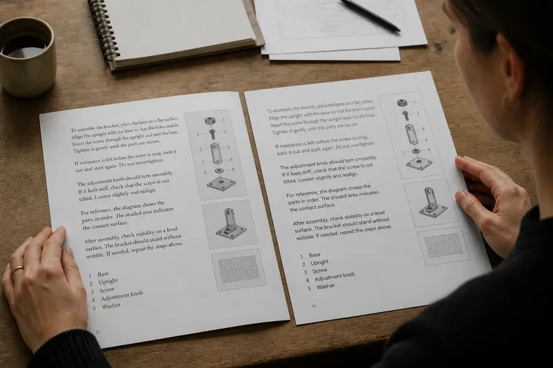
Imagine a short instruction booklet printed on slightly absorbent paper, with compact paragraphs and diagrams in the margins. If its initial proof looks crowded, the designer might widen the measure, add a little leading, or choose a more open typeface before increasing the overall size. The observable result to look for is a page where readers can follow each line and find the next instruction without the text merging visually with the diagrams.
Judge a printed proof at reading distance
A useful comparison keeps the content and page format constant. Set the same paragraph in a serif and a sans serif at comparable sizes, then print both on the intended paper. Keep margins, line length, leading, and ink treatment consistent for the first comparison. Otherwise, a change in spacing or page width may be mistaken for an effect of the type style.
Look at the proof at the distance people are likely to hold or place it. Notice whether lowercase letters remain distinct, whether punctuation is visible, and whether the spaces between words seem even. Follow several lines down the page and see if the return to the left edge feels easy to make.
Then adjust one variable at a time. Try a slightly larger size, a different measure, or more leading, and compare the revised proof with the original. Changing several settings simultaneously can make the page look better or worse without showing which adjustment mattered.
Do not judge only by how many words fit on a page. A compact setting may reduce page turns yet create a dark, tiring block. Conversely, generous spacing can make a text feel calm while forcing awkward breaks or leaving too little room for the material that accompanies it. The purpose is not maximum density or maximum openness, but a readable arrangement that serves the content.
Common questions about type for long printed pages?
Are serif fonts easier to read in print?
Not as a universal rule. A well-designed serif face can provide a steady text texture, but size, spacing, line length, paper, and the reader’s task all influence the experience. Compare actual paragraphs in the intended format rather than relying on a broad claim about the category.
Can a sans serif work for a novel or long essay?
Yes, if its letterforms and spacing remain comfortable in continuous text. Open counters, recognizable lowercase shapes, and a suitable measure can matter more than the absence of serifs. The printed proof should still be judged across several pages, not just a short sample.
Should serif and sans serif faces be mixed?
They can be, especially when the page needs a clear difference between body text and headings, captions, or labels. Choose faces that share a compatible scale and tone, then check that the hierarchy is immediately understandable. A pairing that creates extra visual noise may be less useful than one consistent family.
How should type be chosen for small print?
Look for sturdy strokes, open counters, and clear distinctions among similar letters, then print a proof at the intended size. A small change in size or leading may improve the page more than a switch from serif to sans serif. If the material has production requirements, follow the printer’s specifications for the final stock and process.
Choose the type that supports the reader’s next move
For a long printed page, the stronger choice is the face that makes the intended reading task feel clear at the scale and spacing the design can afford. Serif and sans serif are useful starting descriptions, not verdicts. Their differences become meaningful only alongside the page’s measure, rhythm, material, and purpose.
When comparing serif or sans serif for a long printed page, make the final decision from a proof that resembles the finished piece. Read a passage, scan for a heading, return to a line after looking away, and check how the page handles its margins and supporting elements. The most persuasive type choice is often the one that lets attention stay with the text instead of the mechanics of reading.